Hi, Metal Gladiators! How are you all doing? I hope you’re good 🙂
This is Camii Bathory, UI/UX Lead Artist, and I am here to tell you what’s behind the User Interface of Heavy Metal Machines.
The game has had many changes throughout the development process and it had a direct impact on the interface. It all started in the alpha version. The game was ripening and getting a shape, so the interface followed the identity. After the Alpha, we’ve reached a moment where the game went through a re-design and noted that the interface was split into two styles. One on the main menu and another on the match’s HUD (heads-up display).
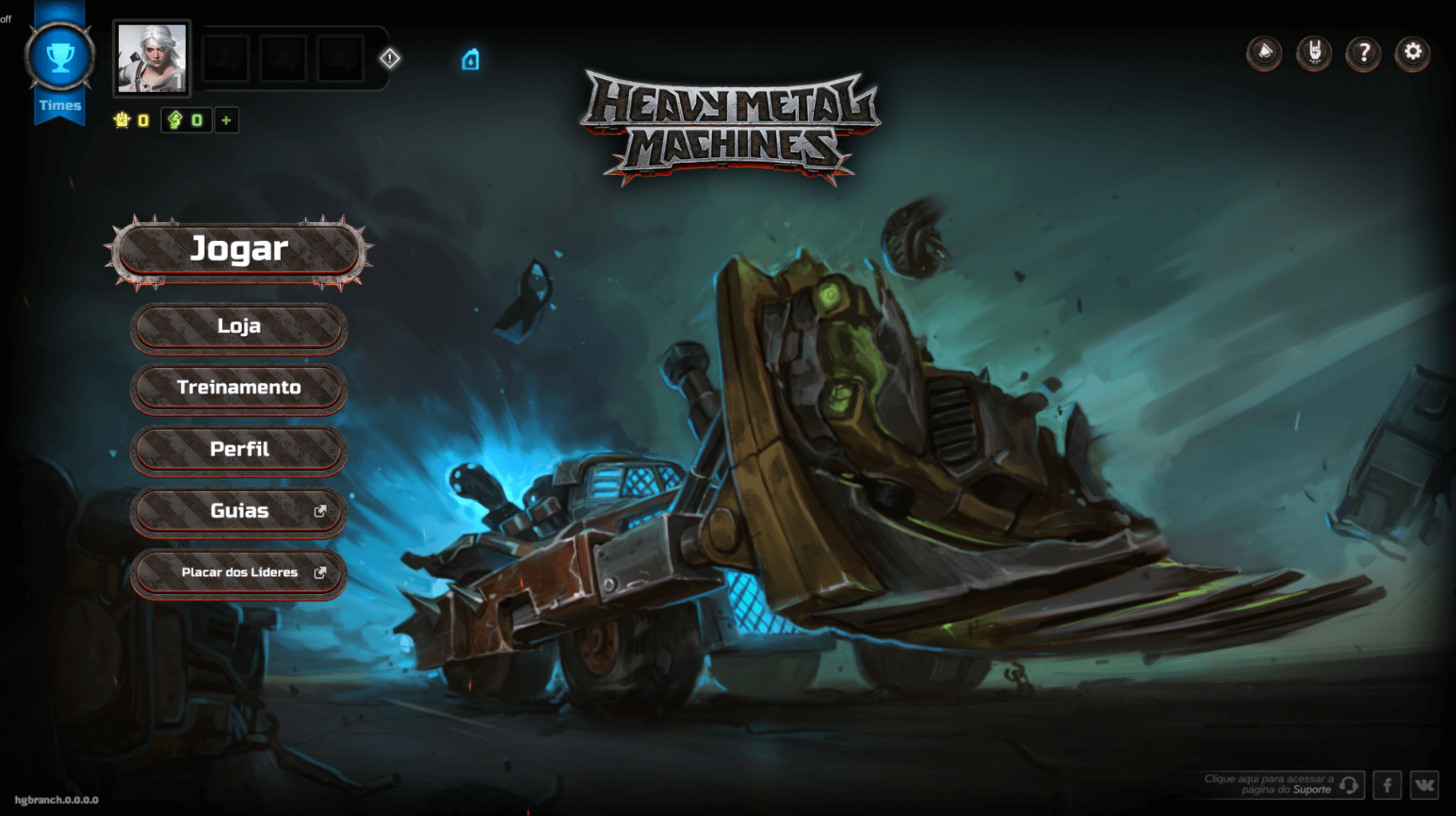
On the main menu, we noticed an interface carrying more physical elements, like buttons made of metal and textures, and audio of impacting rough metal. On the HUD, we had it flat, clean, with light elements, connecting to a car panel’s assets. We went through this line to make it easier the visibility during a match, leaving the “heavy metal” thing to the cars, visual effects and soundtrack. In the end, the interface was not making connections with itself from the beginning to the end of the game.
So we found a new challenge: we have to make our interface more coherent, concise and beautiful (always, right :P). We couldn’t launch the game with the division of styles. Our team started looking for solutions and after heavy researches and tests, we “reskinned” all the interface and improved the HUD. We united the styles, enhancing the user experience and creating a more professional look to HMM.
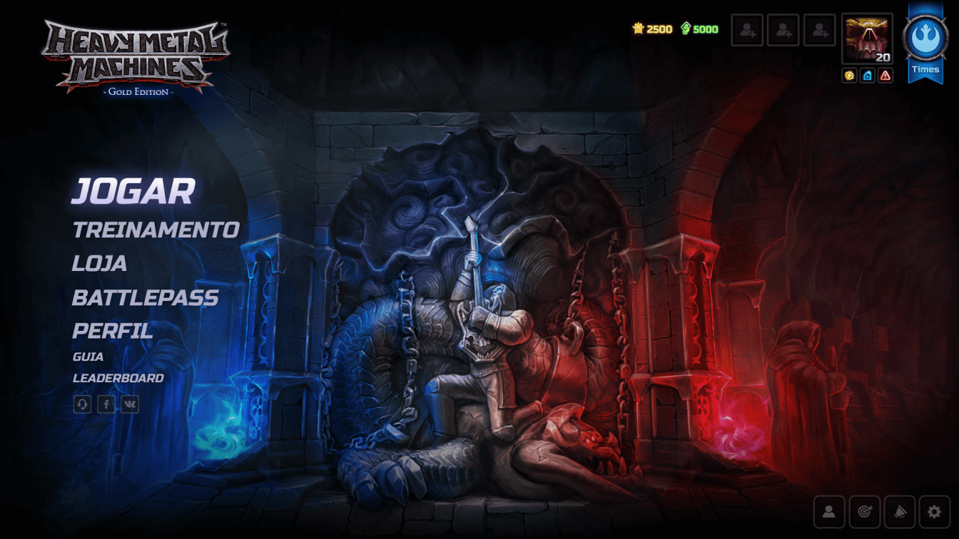
We brought bright and clean elements to our interface, in a way that they contrast properly with the characters and the gameplay style. Our goal is to connect the visual to a car’s bright dashboard. With the hard work of our team, we developed an UI (user interface) and much more fun and intuitive experience to our players!
Xoxo, Camii